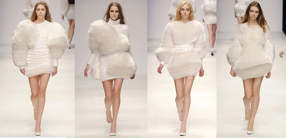
Central St. Martins MFA Graduates
There was so much white in this show! Normally I'm not a fan of white, especially in body-covering columns, but I thought some of the designers did interesting things with it.
I don't even know what technique he used to get those pleats to stand out like that. Maybe some kind of inner construction? Anyways, I thought it was an interesting enough detail to overlook his color impairment. Plus, slapping some some medium pile shearling in the middle of a pure white garment was pretty ballsy. I mean, it kind of looks like she has wicked chest hair.
MORE WHITE. It almost boggles the mind. The rest of this dude's stuff was pretty boring, but I chose these pieces because I thought the twisty lapels, and giant sleeves with the perfect little folds where they meet the body, were kind of awesome.
OU LOOK, FUR IN DIFFERENT BUT EQUALLY POOFY SHAPES. Also, white.
It's hard to see in these small photos, but those are STACKS of fabric. How very interesting! Not something you see very often. That little rectangle in the chest seems to be a popular theme this season as well. You'll see more of those later, I guarantee it.


